BESPOKE MARKETING
Objective:
Create an interactive piece introducing new B2C Performance Marketing Initiative, Bespoke that would take clients and new prospects through a builder widget that teases how the program works.
Contributions:
- Led conversations around design to art director, copywriters and stakeholders (product and sales)
- Designed and developed piece from conception / lo-fidelity and hi-fidelity wireframes to final piece using Adobe Illustrator, Adobe XD and Ceros.
- created dozens of assets surrounding the final piece including digital ads, powerpoints, and sale slicks
- continued to maintain and make revisions alongside copywriter and stakeholders
Results:
- The program generated over six figures in revenue in it's first quarter.
- Enabled product and sales team to present and discuss new marketing initiatives to clients and stakeholders.
User Profiles:
This piece was meant to serve as both a hands-on tool that would enable sales to through their client calls/discussions and also as a standalone piece that prospects could walk through on their own if they come across this through marketing efforts or organically,


Feature Planning:
Worked with copywriters, and marketing stakeholders to decide on which features were to get added and how we presumed the layout would look.


Wireframing and Prototyping:
Initial lo-fi wireframe:
The initial wireframe was laid out as a classic long-form infographic that outlined the steps that explained how the program worked.
Challenges: The design wasn't streamlined and would take several minutes for CSM / Client to get through.

Final lo-fi wireframe:
The final wireframe contained a condensed widget that users could interact with to take them through a series of steps that outlines and demonstrates how the program works.


Design decisions:
V1 Prototype:

Version 1:
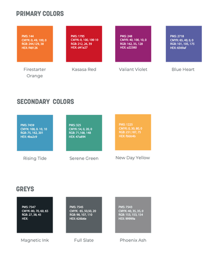
Kasasa was in the process of a rebrand that was still unannounced at the time of this product launch. The challenge was to use the existing brand colors as shown below in a visually new way that would seamlessly transition to the new brand launch.

Heuristics:


Takeaways / User Analysis:
-Step 2 involved choosing between 2 selections. The option to do this was possibly confusing for users / led to the least engagement out of all the other steps. Surprisingly, despite the confusion, the engagement did not fall off after Step 2. This led me to believe users were clicking through and engaging with the interactions multiple times throughout their experience. (Fig 1.1)
-The main CTA that led to the demo form was placed at the bottom of the page and got covered up once the user clicked on the pop-up button to show some samples. Only 71 users out of 141 knew to close the pop up to reveal the main CTA (Fig 2.1). This led to only 2% of users clicking the outbound CTA link. (Fig 2.2)
-The hover interaction on the top of the page that allows users to learn more about the product / channel offerings do not collect any data. I would likely convert this to a click function to track engagement / interest.


Fig 1.1

Fig 2.1

Fig 2.2
Version 2:
V2 Prototype:

Version 2 (UI redesign):
Version 2 of this piece leverages the company's new brand colors and components, following design systems that were put in place across our B2C web and mobile experiences while also using components from version 1 of this design.